|
DES 230 .
| |
|
DESIGN
AND COLOR

The elements and principles of design are the building blocks used
to create a work of art. The Elements of design can be thought of as the
things that make up a painting, drawing, design etc. Good or bad - all
paintings will contain most of if not all, the seven elements of design.
The
Principles of design can be thought of as what we do to the elements of
design. How we apply the Principles of design determines how successful we
are in creating a work of art.
note
- the hyperlinks within the text of this page will open information
in a new browser window. After you have read that information the window
can then be closed leaving this window open.
THE ELEMENTS OF DESIGN
LINE
Line can be considered in two ways. The linear marks made with a pen or
brush or the edge created when two shapes meet.
SHAPE
A shape is a self contained defined area of geometric or organic form. A
positive shape in a painting automatically creates a negative shape.
DIRECTION
All lines have direction - Horizontal, Vertical or Oblique. Horizontal
suggests calmness, stability and tranquillity. Vertical gives a feeling of
balance, formality and alertness. Oblique suggests movement and action
|
|
|
The
element of direction can have a powerful influence on the mood of
a painting. It is something often overlooked, but making a
conscience decision about the dominant direction in a painting can
have a noticeable effect on the atmosphere of the work.
Sometimes
the subject will dictate the dominant direction. Sometimes the
subject will allow you to impose a direction on it.
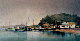
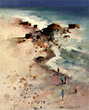
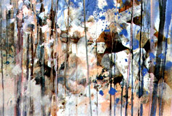
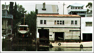
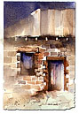
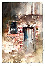
In
the paintings below the subject dictates the direction. The strong
horizontal lines of the water, boats and buildings in the first
example give a feeling of stillness and calm. In the second
example, the diagonal lines of the shoreline and the rocks
reinforce the feeling of movement. The third example has a
dominant vertical direction which adds a static orderly influence
to what might be a random chaotic painting.
|
|
|
|
|
|
|
|
|
|
|
|
|
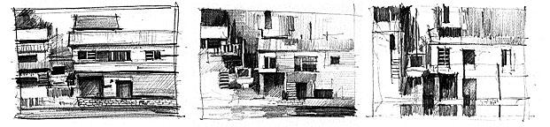
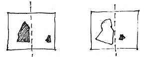
In
this subject it is possible to impose either a horizontal,
vertical or oblique dominant direction. The drawings below show
the effect of different treatments
|
|
|
|
|
|
|
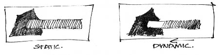
A
horizontal emphasis tends to make the buildings look
sleek and clean and creates a fairly static atmosphere.
|
|
A
diagonal dominance reinforces the chaotic nature of the
subject
|
|
Emphasizing
a vertical direction maintains the random chaos, but
gives a solid formal feeling to the work
|
|
SIZE
Size is simply the relationship of the area occupied by one shape to that
of another.
TEXTURE
Texture is the surface quality of a shape - rough, smooth, soft hard
glossy etc. Texture can be physical (tactile) or visual.
Texture
is an obvious and important element in a painting. To save confusion it
can be broken into two parts.
Physical
Texture is the texture you can
actually feel with your hand. The build up of paint, slipperiness of soft
pastel, layering of collage - all the things that change the nature of the
papers surface.
Visual
Texture is the illusion of physical
texture, created with the materials you use. Paint can be manipulated to
give the impression of texture, while the paper surface remains smooth and
flat.
Traditional
transparent watercolour makes little use of physical texture other than
the roughness of the paper. Mixed media allows advantage to be taken of
physical as well as visual texture.
|
|
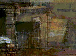
This
detail shows the use of visual texture.
The surface appears fractured and broken
but this is an illusion created with the paint.
The paper in this area of the work is
smooth and flat.
|
|
|
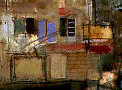
In
this detail patches of Japanese rice paper,
gesso and thick swipes of soft pastel add a
strong three dimensional physical texture.
|
|
Understanding
the difference between physical and visual texture helps us take full
advantage of this element.
Things
to consider
Texture
is often something that finds its way into a painting in an accidental
sort of way, particularly with mixed media. Lumps, bumps and scratches pop
up all over the place, often bearing no relationship to the painting. Make
it a habit to question whether these marks help the work or just add
unnecessary confusion.
Some
heavily textured watercolour papers can have an overbearing effect on a
painting. Alwaystry and relate this type of paper to your subject
Texture
can have more impact through variation and relief - contrasting rough,
course areas with orderly patterned areas and providing smooth areas of
relief will make a painting far more interesting than an even, unrelieved
texture running from edge to edge.
Remember
- creating textures is easy, it’s where and how you place them that
makes the difference between a good painting and an ordinary one.
click on each of these images for
demonstrations of physical and visual texture
COLOR
Also called Hue
see
notes on colour
VALUE
Value is the lightness or darkness of a colour. Value is also called Tone
see
notes on tonal contrast
THE PRINCIPLES OF DESIGN
BALANCE
Balance in design is similar to balance in physics
A large shape close to the center can be balanced
by a small shape close to the edge. A large light
toned shape will be balanced by a small dark toned
shape (the darker the shape the heavier it appears to be)
GRADATION
Gradation of size and direction produce linear perspective. Gradation of
of colour from warm to cool and tone from dark to light produce aerial
perspective. Gradation can add interest and movement to a shape. A
gradation from dark to light will cause the eye to move along a shape.
REPETITION
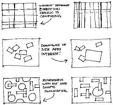
Repetiton with variation is interesting, without variation repetition can
become monotonous
see
notes on repetition
CONTRAST
Contrast is the juxtaposition of opposing elements eg. opposite colours on
the colour wheel - red / green, blue / orange etc. Contrast in tone or
value - light / dark. Contrast in direction - horizontal / vertical.
The major contrast in a painting should be located at the center of
interest. Too much contrast scattered throughout a painting can destroy
unity and make a work difficult to look at. Unless a feeling of chaos and
confusion are what you are seeking, it is a good idea to carefully
consider where to place your areas of maximum contrast.
HARMONY
Harmony in painting is the visually satisfying effect of combining
similar, related elements. eg.adjacent colours on the colour wheel,
similar shapes etc.
DOMINANCE
Dominance gives a painting interest, counteracting confusion and monotony.
Dominance can be applied to one or more of the elements to give emphasis
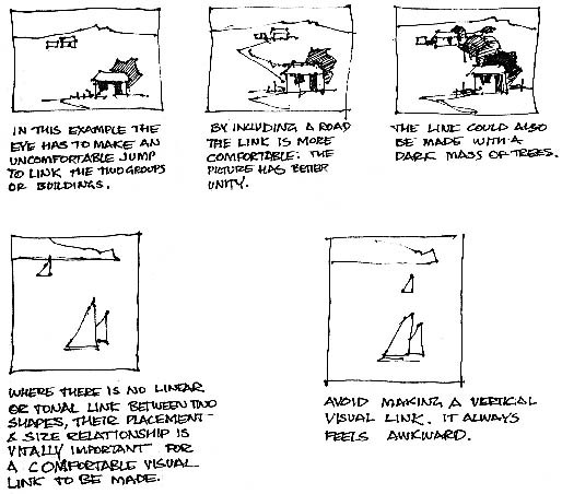
UNITY
Relating the design elements to the the idea being expressed in a painting
reinforces the principal of unity.eg. a painting with an active aggressive
subject would work better with a dominant oblique direction, course, rough
texture, angular lines etc. whereas a quiet passive subject would benefit
from horizontal lines, soft texture and less tonal contrast.
Unity in a painting
also refers to the visual linking of various elements of the work.
|
|
After
studying these notes on the elements and principals of design,
try
this exercise
©
John LOVETT
|
Decorating with Color
Color Wheel Lessons
Content provided
by
Better Homes
 |

Color Wheel
Lessons
Choosing color combinations is one of the most intimidating steps
for beginning decorators. To make the job easier, you can rely on
the interior designer's most important color tool: the color
wheel. Here's a look at four basic color schemes built using this
time-honored device.
A Strong Foundation: Primary Colors
For rooms that come off feeling strong and solid, a scheme of
primary colors—red, blue, and yellow—is an ideal choice. Each
is a pure color that can't be created by mixing other hues. Use
them in pairs or combine all three; they work equally well in
country, traditional, and modern rooms.
The Next Step: Secondary Colors
Secondary colors—green, orange, and purple—are created by
mixing two primaries in equal amounts. Like all colors, each
secondary hue can be tinted with white or shaded with black for
variations. If you can't envision a bold orange and green room,
think about pairing up their paler tints of peach and sage. The
primary and secondary colors illustrate that you can make a
compatible triadic scheme by choosing any three colors equidistant
on the wheel.
Intermediate Players: Tertiary Colors
These colors are an equal mix of a primary and its closest
secondary color: blue-green, yellow-green, red-orange, red-purple,
and blue-purple. Combine these colors for a sophisticated look.
Single-Shot Color: Monochromatic
What prevents a monochromatic scheme from being bland is subtle
variation of a single color's intensity. For instance, orange,
coral, and peach offer variety within the same family.
|
How Color Affects Mood
Relying strictly on the color wheel to make decorating decisions
leaves an important factor out of the equation: the moods that colors
can create. The colors you live with really do influence your
emotions. Some palates lighten and brighten your mood while others
pacify or purify. We respond to color with our hearts, not just our
heads, so it's important to choose wisely. Understand that colors
behave in three basic ways—active, passive, and neutral—and you
can easily match every room's colors to your personal desires and
taste and to the room's purpose.
 |
Active Colors
On the warm side of the color wheel, active colors include yellow,
orange, and red. Extroverts, these advancing hues step out in the room
to greet and sometimes dominate. They inspire conversation and an
upbeat attitude. Red, the most intense, pumps the adrenaline like no
other hue. Small doses of the fire-engine hue wake up an entry or turn
up the heat on a hearthside den. Golden or lemony yellows—good for
home offices and kitchens—unleash creative juices.
 |
Passive Colors
The cool colors—blue, green, and purple—will pacify, staying
quietly in the background to calm and restore depleted spirits.
They're ideal for bedrooms or private retreats, but if yours is a cold
climate, you may want to work in some sunny accents for warmth and
contrast.
Neutral Colors
Neutralizers are the "uncolors": browns, beiges, grays,
whites, and taupes. They neither activate nor pacify but combine and
cooperate, bridging together different rooms and colors. They're good
transitions on woodwork, trim, hallways, and functional spaces like
kitchens and baths, but even living rooms can benefit. Darker neutral
stone down other colors; crisp white intensifies them.
Color
Language
Curious about how color influences mood? Here are a few examples:
 | Pink: soothes,
acquiesces; promotes affability and affection.
| Yellow:
expands, cheers; increases energy.
| White:
purifies, energizes, unifies; in combination, enlivens all other
colors.
| Black:
disciplines, authorizes, strengthens; encourages independence.
| Orange:
cheers, commands; stimulates appetites, conversation, and charity.
| Red:
empowers, stimulates, dramatizes, competes; symbolizes passion.
| Green:
balances, normalizes, refreshes; encourages emotional growth.
| Purple:
comforts, spiritualizes; creates mystery and draws out intuition.
| Blue:
relaxes, refreshes, cools; produces tranquil feelings and peaceful
moods. |
| | | | | | | |
|
|